Plotting data using ggplotnim
In this tutorial we will introduce ggplotnim, a Nim plotting library heavily inspired
by the great R library ggplot2.
This will be kept rather brief, but we will discuss the philosophy of the syntax, look at a reasonably complex plotting example that we deconstruct and finish of by (hopefully) coming to the conclusion that the ggplot-like syntax is rather elegant.
For this tutorial you should have read the data wrangling introduction to Datamancer or
know about data frames and have seen the Datamancer formula macro f{}.
On philosophy and graphics
Similar to most areas of life touched by more than a few people who seemingly all have their own ideas about the right way to do things, plotting libraries come in different shapes and forms. In terms of their output formats, choice of colors and style and of most importance for us here: in terms of their API / the programming syntax used.
Most plotting libraries fall into a category that are either focused on object orientation
(your commands return some objects for you to modify to your needs) or a generally imperative
style (call this function plotFoo for plot style A, that function plotBar for style B,
etc.) and often some combination of these two.
ggplot2 and as a result ggplotnim follow a declarative style that builds up a plot
from a single command by combining multiple different layers as a chain of commands.
This is because ggplot2 is an implementation of the so called "grammar of graphics".
It's the NixOS of plotting libraries. Tell it what you want and it gets it done for you,
as long as you speak its language.
A motivating example
Let's now consider a somewhat complicated plotting example. Using that we will look at why it is called a grammar of graphics.
## ignore the dummy `df` here. This is to be able to compile the code (we throw away
## the `ggplot` result as we don't call `ggsave`)
let df = toDf({"Energy" : @[1], "Counts" : @[2], "Type" : @["background"]})
discard ggplot(df, aes("Energy", "Counts", fill = "Type", color = "Type")) +
  geom_histogram(stat = "identity", position = "identity", alpha = 0.5, hdKind = hdOutline) +
  geom_point(binPosition = "center") +
  geom_errorbar(data = df.filter(f{`Type` == "background"}),
                aes = aes(yMin = f{max(`Counts` - 1.0, 0.0)}, yMax = f{`Counts` + 1.0}),
                binPosition = "center") +
  xlab("Energy [keV]") + ylab("#") +
  ggtitle("A multi-layer plot of a histogram and scatter plot with error bars")
It may seem overwhelming. But it's actually simple and can be read from top to bottom. In words all this says is:
"Create a plot from the input data frame df using column 'Energy' for the x axis, 'Counts'
for the y axis and color the data (both outline color and fill color fill) based on the
discrete entries of column 'Type'. With it draw:
- a histogram without statistical computations (
stat = "identity", i.e. don't compute a histogram but use the data as a continuous bar plot), draw them in identity position (where the data says, no stacking of bars), add some alpha to the color and draw it as an outline. - a scatter plot in the center positions of each bin (
binPosition = "center"), as the data contains bin edges. - errorbars for all data of type 'background' (
data = df.filter(…)), where the error bars range fromyMintoyMaxfor all points, also in center position.
Finally, customize x (xlab) and y (ylab) labels and add a title (ggtitle)."
The only thing we left out is the ggsave call, as we only have a dummy data frame here. We
will now walk through the basic building blocks of every plot and then look at the above as
an actual plot. After reading the next part looking at the plot above again should make it seem
less dense already.
The 3 (or 4) basic building blocks of a "ggplot" plot
There are 3 (in some respect 4) major pieces that make up the basic syntax of every single
plot created by ggplot2 or ggplotnim. We will quickly go through these now. Keep
in mind that every option that might be automatically deduced can always be overridden.
Input data
The zeroth piece (hence maybe 4) of a ggplot plot is the input data. It always comes
in the form of a DataFrame that contains the data to be plotted (or at least the data
from which the thing to be plotted can be computed from, more on that later). If not
overridden manually the columns that are to be plotted define the labels for
the axes in the final plot.
In addition the library will determine automatically (based on column types & heuristic rules) whether each column to be plotted is continuous or discrete. Continuity and discreteness are a major factor in the kinds of plots we may create (and how they are represented).
So for the next sections let's say we have some input data frame df.
The ggplot procedure
The first proper piece of every plot is a call to the ggplot procedure. It has a rather
simple signature (note: we drop 2 arguments here, as they are left over in the code for "historical"
reasons, namely numX/YTicks):
proc ggplot*(data: DataFrame, aes: Aesthetics = aes(), …): GgPlot =
The first argument is the aforementioned input DataFrame. With our data frame, we can
write down the first piece of every plot we will create:
ggplot(df, …)
Simple enough. This doesn't do anything interesting yet. That's what the aes is for.
aes - Aesthetics
The aes argument of the ggplot procedure is the first deciding piece of our plotting
call. It will essentially determine what we wish to plot and to some extend how we
want to plot it.
"Aesthetics" are the name for the description of the "aesthetic description" about which data to use for what visible purpose. This might sound abstract, but will become clear in a few seconds.
For the simplest cases (a scatter or line plot, a histogram, ...) we simply hand a (or multiple) column(s) to draw. Depending on whether a column contains discrete or continuous data decides how the axis (or additional scale) will be laid out.
To construct such an Aesthetic argument the aes macro is used. While it is a macro it
behaves like a regular procedure and can take the following arguments:
xycolorfillshapesizexminxmaxyminymaxwidthheighttextweightyridges
quite the list!
Taking a closer look at the kind of arguments gives us maybe an inkling of what it's all about. The argument either maps to a physical axis in the plot (x, y), a "style"-like thing (color, fill, shape, size) or some more "descriptive" thing (e.g. for sizes x/yMin/Max, width, height), and finally some slightly "special" ones (text, weight, yridges).
What each of these mean for the final plot (again) depends on the data being discrete or continuous.
As an example:
- Discrete, each discrete value:
- x and y: has one tick along x or y
- color: has one color
- shape: has one shape
- size: has one size
- Continuous, each value:
- x and y: map to a continuous range between min and max values
- color and fill: has a color picked from a continuous color range
- size: has a size picked from a continuous range between smallest and largest size
- shape: not supported, there are no "continuous shapes"
(for the other aesthetics also only either discrete or continuous make sense. For instance "text" is always a discrete input, it's used to draw text onto a plot. yridges is to create a discrete ridgeline plot, etc.)
How these are finally applied still depends on what comes later in the plotting syntax. But in principle the mapping to more specific things to be drawn is natural. For a point plot the size determines the point size and the color the point color. For a line it's line width and color and so on.
This part of the ggplot construction might be the most "vague" at first. But with it we can
now continue our construction. Assume our data frame df has columns "Energy" and "Counts" (continuous),
"Type" (discrete).
ggplot(df, aes("Energy", "Counts", fill = "Type", color = "Type"))
In a sense this has described a coordinate system for our plot. From the continuous / discrete columns
we can determine the data ranges ranges / classes for each "axis". Every aesthetic can
be considered an "axis" here. For example a scatter plot of x and y values that is also classified
by color using discrete column A and by shape using discrete column B is technically a 4
dimensional representation.
Formulas as aes arguments
If you paid close attention to the plot example above, you will have noticed that for yMin and yMax
we did not actually hand a column, but rather a ggplotnim formula. This is the main reason aes is a macro.
You can hand any formula that references local variables or column references, or simply assign
constant values (aes(width = 5) is perfectly valid). ggplotnim will compute the resulting values
for you automatically before plotting.
To summarize, you can use one of the following three things as values to aes arguments:
- a string literal referring to a column
- a formula computing some constant value or some operation using data frame columns
- a constant (non string) value that can be stored in a data frame
For formulas and constant values the corresponding absolute value will be computed for each data frame entry to be plotted.
geoms - Geometric shapes to fill a plot
Input data and aesthetics of course are not enough to actually draw a plot. So far we have only stated what part of the data to use and added a discrete classification by one column (fill and color the "Type" column).
This is what all available geom_* procedures are for. They return Geom variant objects that mainly
just store their kind and possibly some specific information required to draw them.
The (currently) implemented geoms are as follows (with the required aesthetics listed):
geom_point: draw points for eachx/ygeom_line: draw a line through allx/ygeom_errorbar: draw error bars fromxMintoxMaxoryMintoyMaxatx/ygeom_linerange: draw lines fromxMintoxMaxoryMintoyMaxgeom_bar: draw a discrete bar plot using the occurrences (defaultstat = "count") of each discrete value inxor the number of counts indicated iny(stat = "identity")geom_histogram: draw a continuous bar plot computing a histogram from continuous variablex(defaultstat = "bin") or draw continuous bars starting atxand the number of entries indicated iny(stat = "identity").geom_freqpoly: same asgeom_histogram, but connect bin centers by lines instead of drawing barsgeom_tile: draw discrete tiles atx/y(default position bottom left) with widthwidthand heightheighteach. Tiles don't need to touch.geom_raster: draw fully connected tiles atx/yofwidthandheight.widthandheightmust be constant!geom_text: draw text atx/ycontainingtext(thetextaesthetic)
Here we stated mainly the typical (or default) use cases. All geoms take all arguments. That means
you can also draw a histogram using points by applying the stat = "bin" argument. The difference
is just in the defaults! Or in case of a geom_histogram call you can indicate that the binPosition
should be "center" instead of the default "left" to have x indicate the bin centers.
The possibilities are almost endless. You can combine any geom with (almost) any option and
it should just work (few exceptions exist, e.g. geom_raster only draws fixed size tiles for performance).
One final thing to mention: the geom_histogram procedures also take data and aes
arguments. This means one can override the data or the aesthetics for a single geom!
Applying geom layers to build the initial plot
We now need to apply the input data and selection of columns to things we can actually draw.
This is where the layering structure of ggplot actually becomes apparent, because from here
we will list all kinds of geoms to draw. The order we list them directly determines
the order they are drawn in.
Step by step we will now add layer by layer and look at what happens with each to reproduce the plot talked about in the beginning. For that purpose we will generate a data frame that we will use in all following snippets. It will contain 3 columns:
- "Energy": a column of twice 25 elements covering the range (0, 10) with 25 entries
- "Counts": a column of twice 25 random entries between 0 and 10. The first 25 elements are drawn as floats (to get fractional values) and the second 25 entries will be random integer numbers
- "Type": simply a column that designates the first 25 rows as "background" and the latter 25 as "candidates"
Our construction in the following is a bit artificial of course.
import ggplotnim, random, sequtils
randomize(42)
let df = toDf({ "Energy" : cycle(linspace(0.0, 10.0, 25).toRawSeq, 2),
                    "Counts" : concat(toSeq(0 ..< 25).mapIt(rand(10.0)),
                                      toSeq(0 ..< 25).mapIt(rand(10).float)),
                    "Type" : concat(newSeqWith(25, "background"),
                                    newSeqWith(25, "candidates")) })
echo "Input data frame: "
echo "Head(10): ", df.head(10).pretty(10)
echo "Tail(10): ", df.tail(10).pretty(10)
Input data frame:
Head(10): DataFrame with 3 columns and 10 rows:
Idx Energy Counts Type
dtype: float float string
0 0 7.11 background
1 0.4167 4.38 background
2 0.8333 1.241 background
3 1.25 3.799 background
4 1.667 7.506 background
5 2.083 1.701 background
6 2.5 4.399 background
7 2.917 4.608 background
8 3.333 2.304 background
9 3.75 5.275 background
Tail(10): DataFrame with 3 columns and 10 rows:
Idx Energy Counts Type
dtype: float float string
0 6.25 4 candidates
1 6.667 2 candidates
2 7.083 5 candidates
3 7.5 1 candidates
4 7.917 3 candidates
5 8.333 3 candidates
6 8.75 2 candidates
7 9.167 6 candidates
8 9.583 8 candidates
9 10 0 candidates
What we want to achieve as a final plot is the following, where the explanations are mainly due to the original motivation of where the plot example is taken from:
- a histogram for each "Type", drawn with one color each and a bit transparent so they are visible where they overlap. Let each bin content correspond to some data point at that energy.
- also plot the actual data points on top of the bins. For the "background" like data we have fractional values as it's values are normalized to the "candidates" (simply by scaling from some hypothetical time for background / time for candidate data).
- For the background data we want error bars. They represent our uncertainty of the background hypothesis.
- the candidates are just counts we measured. They don't have inherent uncertainties (from a frequentist perspective we have to repeat the experiment many times and then we can write down some variance in our candidates)
Building layer 1 - geom_histogram
So, let's start with drawing a histogram of "Energy" and "Counts":
ggplot(df, aes("Energy", "Counts")) +
  geom_histogram() +
  ggsave("images/multi_layer_histogram_0.png")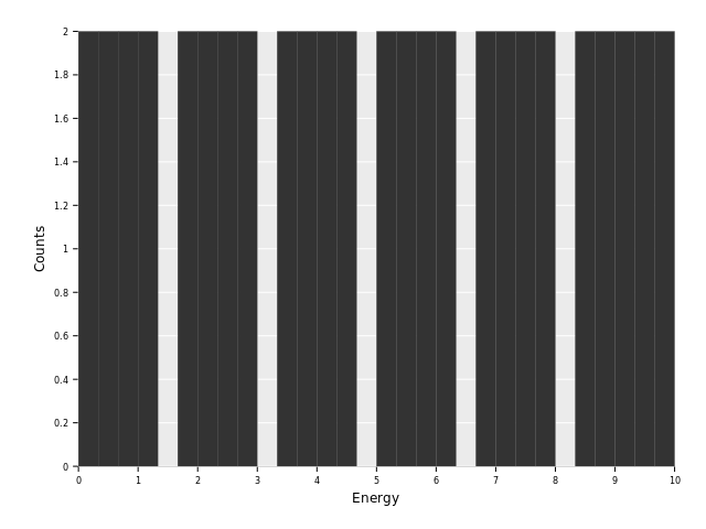
So, uhm. This looks rather broken! Or at least not what we want. What's going on?
We're asking for a histogram! By default this means ggplotnim will compute the
histogram based on the x aesthetic. (Note: it should at least print a warning
message if a y aesthetic is given that user probably wants identity stats!).
Instead our data is already binned. We need the stat = "identity" option to
the geom_histogram call:
ggplot(df, aes("Energy", "Counts")) +
  geom_histogram(stat = "identity") +
  ggsave("images/multi_layer_histogram_1.png")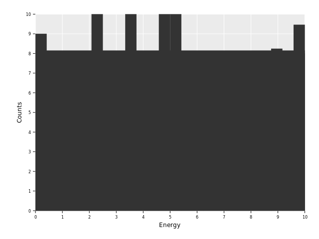
This looks a bit better. At least we have something that sort of resembles our
input data! But what's that wide gray bar spanning the whole x range with a
height of roughly 3?
Our data frame covers the x range twice. Once for our "background"
dataset, indices 0 to 24, and then again for our "candidates" dataset,
indices 25 to 49. At the intersection from the first part (index 24)
our "Energy" column is 10.0. From there it jumps back to 0.0 (index
- in the next bin. This leads to a full bin that accidentally covers the full range from 0 to 10 (with a "negative" bin width if we compute
it bin to bin). Let's check that assumption by printing values between index 24 and 26 from our data frame:
echo df[24 .. 26]DataFrame with 3 columns and 3 rows:
Idx Energy Counts Type
dtype: float float string
0 10 8.151 background
1 0 9 candidates
2 0.4167 8 candidates
As we can see index 24 with a value of 2.746 is used for a bin with bin width 10.
To get closer to the plot we want, we will perform classification by a discrete
variable. Let's color by the "Type" column:
ggplot(df, aes("Energy", "Counts", color = "Type")) +
  geom_histogram(stat = "identity") +
  ggsave("images/multi_layer_histogram_2.png")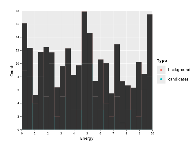
Ohh, interesting. See how we have an automatic legend based on the two classes found in column "Type".
The entries seem a bit high right now. We only sampled up to a total of
10. And didn't we say we want to have classification by color? For bars
color refers to the outline of a bar. We need to add a fill to get the
bars into a fully colored object.
ggplot(df, aes("Energy", "Counts", color = "Type", fill = "Type")) +
  geom_histogram(stat = "identity") +
  ggsave("images/multi_layer_histogram_3.png")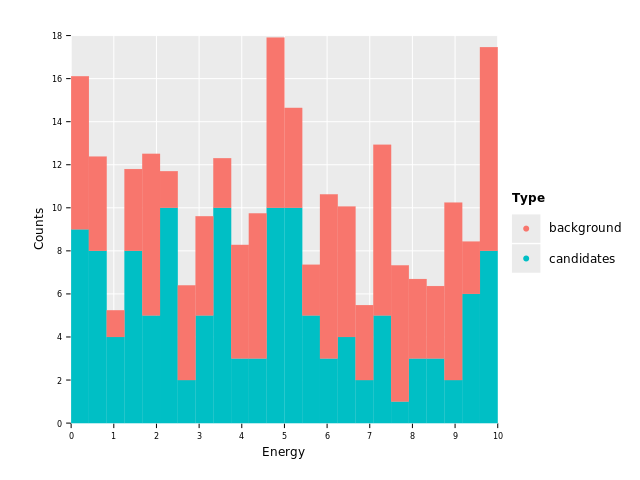
Aha! Apparently both classes are being stacked on top of one another. This is the default behavior for classified histograms so that all the data is visible. Without transparency we would hide data otherwise.
To change this behavior to the one we want we will apply position ="identity":
ggplot(df, aes("Energy", "Counts", color = "Type", fill = "Type")) +
  geom_histogram(stat = "identity", position = "identity") +
  ggsave("images/multi_layer_histogram_4.png")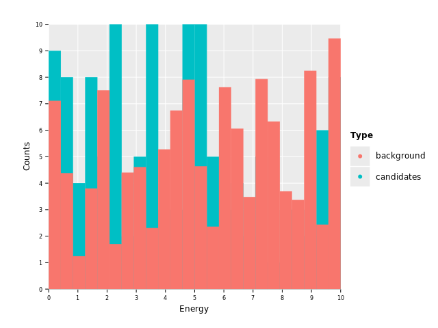
This is already looking somewhat reasonable, barring the fact that we now have the exact problem stacking is supposed to fix. One histogram overlaps the other. We can solve that by applying 50% alpha channel:
ggplot(df, aes("Energy", "Counts", color = "Type", fill = "Type")) +
  geom_histogram(stat = "identity", position = "identity", alpha = 0.5) +
  ggsave("images/multi_layer_histogram_5.png")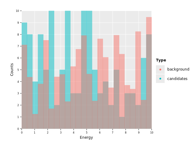
The plot we're seeing is quite pretty already. The only small annoyance is that the outline is still sticking out between all bars, which makes it more busy than it should be. Let's fix that by drawing the histograms using outlines instead of individual bars:
ggplot(df, aes("Energy", "Counts", color = "Type", fill = "Type")) +
  geom_histogram(stat = "identity", position = "identity", alpha = 0.5, hdKind = hdOutline) +
  ggsave("images/multi_layer_histogram_6.png")
Nice, first layer done! This is the result we want to achieve for the histogram part of our plot. As we can see, we've added one geom to the call chain. One layer.
Building layer 2 - geom_point
Next up, let's plot some points for the data to better highlight where our actual
data lies (and to lay the foundation for our error bars). This is as simple as adding
a single geom_point call into the chain:
ggplot(df, aes("Energy", "Counts", color = "Type", fill = "Type")) +
  geom_histogram(stat = "identity", position = "identity", alpha = 0.5, hdKind = hdOutline) +
  geom_point() +
  ggsave("images/multi_layer_histogram_7.png")
But wait. Why are our points on the left side of each bar? Because we defined our
Energy column to contain bin edges. This is because different geoms use different
defaults for their arguments. A histogram with identity statistics essentially interprets
the x axis data as bin edges, whereas point plot of courses uses the x values as the
location where to draw the points.
However, the grammar of graphics allows us to change that as well. Let's tell geom_point
that the data points are bin centers:
ggplot(df, aes("Energy", "Counts", color = "Type", fill = "Type")) +
  geom_histogram(stat = "identity", position = "identity", alpha = 0.5, hdKind = hdOutline) +
  geom_point(binPosition = "center") +
  ggsave("images/multi_layer_histogram_8.png")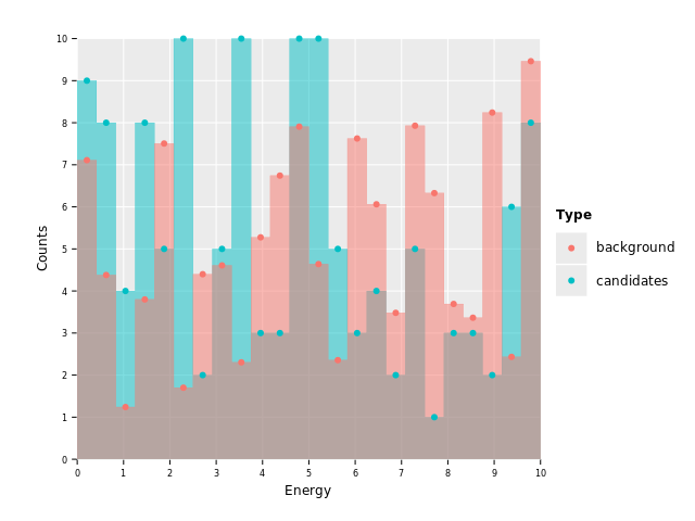
Perfect, now our points are right where they belong. This concludes layer 2.
Building layer 3 - geom_errorbar
This leaves us with a single, final layer. Those of the error bars.
Due to a bug present right now, we cannot call geom_errorbar without min / max
aesthetic args right now (which should in practice raise an exception or
draw nothing, because without limits error bars make no sense).
So, let's assume we want (arbitrary) error bars that are ± 1 at each
point. This can be achieved by assigning a formula to the yMin and
yMax aesthetic in which we describe this relationship. Start with yMin:
ggplot(df, aes("Energy", "Counts", color = "Type", fill = "Type")) +
  geom_histogram(stat = "identity", position = "identity", alpha = 0.5, hdKind = hdOutline) +
  geom_point(binPosition = "center") +
  geom_errorbar(aes = aes(yMin = f{`Counts` - 1.0})) +
  ggsave("images/multi_layer_histogram_9.png")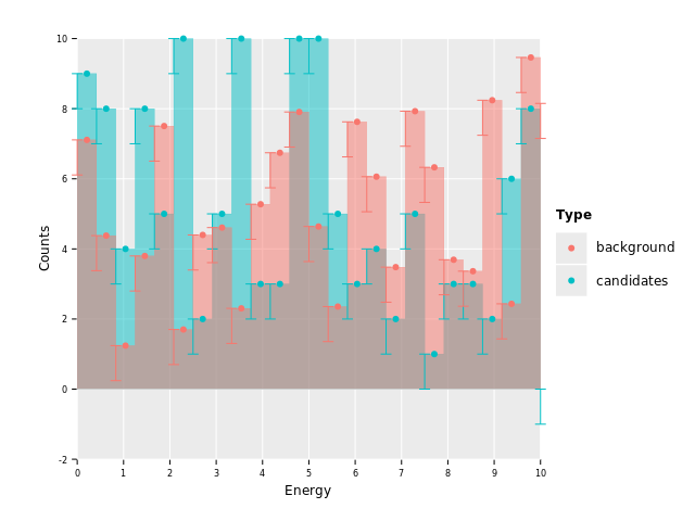
Looking closely, we see that the error bars in some bins go to negative values! That's not acceptable for us. Error bars on counts should stop at 0, because we cannot measure negative counts!
We do this by modifying the formula for yMin to simply take the maximum value
in each case between the computed difference and 0.
And in addition they are also drawn on the left side of each bin. Let's fix both the range of the bar as well as its placement:
ggplot(df, aes("Energy", "Counts", color = "Type", fill = "Type")) +
  geom_histogram(stat = "identity", position = "identity", alpha = 0.5, hdKind = hdOutline) +
  geom_point(binPosition = "center") +
  geom_errorbar(binPosition = "center", aes = aes(yMin = f{max(`Counts` - 1.0, 0.0)})) +
  ggsave("images/multi_layer_histogram_11.png")
Much better. Of course we still only have error bars in the negative direction and lines
down to zero (yMax is unset, so default value 0). On to add positive bars then:
ggplot(df, aes("Energy", "Counts", color = "Type", fill = "Type")) +
  geom_histogram(stat = "identity", position = "identity", alpha = 0.5, hdKind = hdOutline) +
  geom_point(binPosition = "center") +
  geom_errorbar(binPosition = "center", aes = aes(yMin = f{max(`Counts` - 1.0, 0.0)}, yMax = f{`Counts` + 1.0})) +
  ggsave("images/multi_layer_histogram_12.png")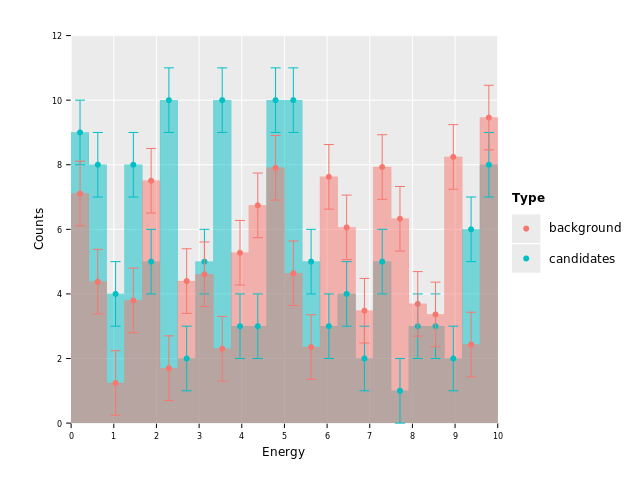
Sweet! But wait, we still have error bars for the "candidates" dataset. This is where
the fact that individual geoms can receive their own data frame comes in. We'll simply
hand geom_errorbar the input data frame filtered to only "background" rows. This way
it will only have that data to plot and we should end up without error bars on the
"candidates" data:
ggplot(df, aes("Energy", "Counts", color = "Type", fill = "Type")) +
  geom_histogram(stat = "identity", position = "identity", alpha = 0.5, hdKind = hdOutline) +
  geom_point(binPosition = "center") +
  geom_errorbar(binPosition = "center", data = df.filter(f{`Type` == "background"}),
                aes = aes(yMin = f{max(`Counts` - 1.0, 0.0)}, yMax = f{`Counts` + 1.0})) +
  ggsave("images/multi_layer_histogram_13.png")
Perfect! Let's round it off by modifying the x and y labels and add a nice
title on top:
ggplot(df, aes("Energy", "Counts", color = "Type", fill = "Type")) +
  geom_histogram(stat = "identity", position = "identity", alpha = 0.5, hdKind = hdOutline) +
  geom_point(binPosition = "center") +
  geom_errorbar(binPosition = "center", data = df.filter(f{`Type` == "background"}),
                aes = aes(yMin = f{max(`Counts` - 1.0, 0.0)}, yMax = f{`Counts` + 1.0})) +
  xlab("Energy [keV]") + ylab("#") +
  ggtitle("A multi-layer plot of a histogram and scatter plot with error bars") +
  ggsave("images/multi_layer_histogram.png")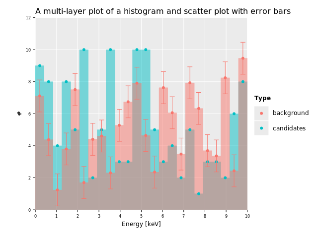
And here we are. We've rebuilt the whole plot from the beginning. Now you should have a good idea of why this plot looks the way it does.
The great thing is that this is the whole workflow of ggplot. You won't have to search
through weird N levels deep inheritances of objects (looking at you, matplotlib!) to
figure out how to do this or that. Every other feature ggplotnim provides is
also handled in the same way. We just replace a few geoms or arguments or maybe add
another command. That's all there is to the grammar of graphics. Simple, but powerful.
With an understanding of the grammar of graphics, one can then essentially plot everything that can be mapped to geometric objects and data, even for example a periodic table.
A gallery of plotting examples
For a large variety of actual plotting example snippets, check out the ggplotnim recipe section here:
Thanks for reading! :)